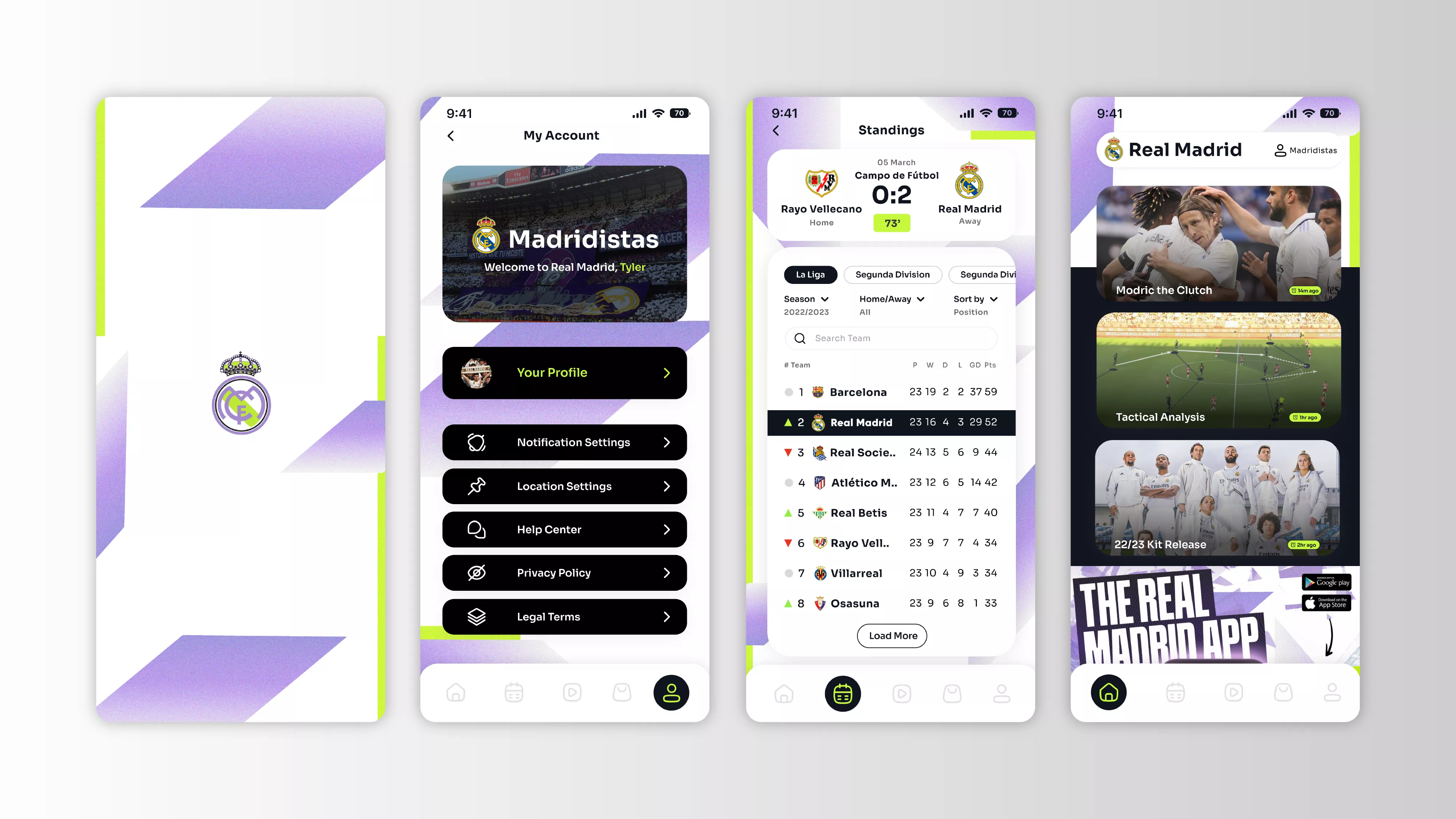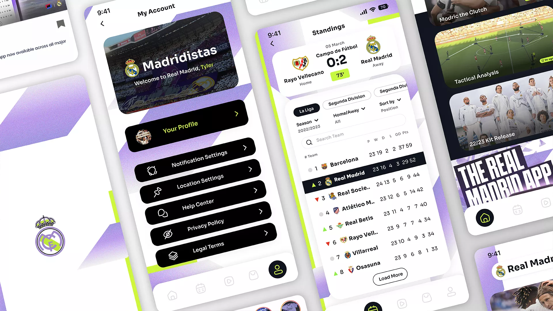
Whilst working at Sony Sports, I contributed to a creative pitch to reimagine the Real Madrid mobile app and explore how one of football’s most iconic brands could evolve for a new digital era. The concept combined the club’s unmistakable identity with a bold and progressive visual language, using its signature white alongside rich purple, black and vibrant green to capture the energy of European nights at the Bernabéu. Across UI design, social content and motion, I developed a digital direction that felt premium, dynamic and unmistakably Real Madrid, while reflecting the ambition and progressive mentality of the club.
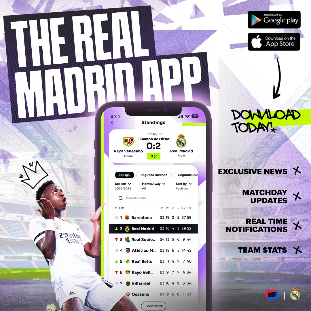
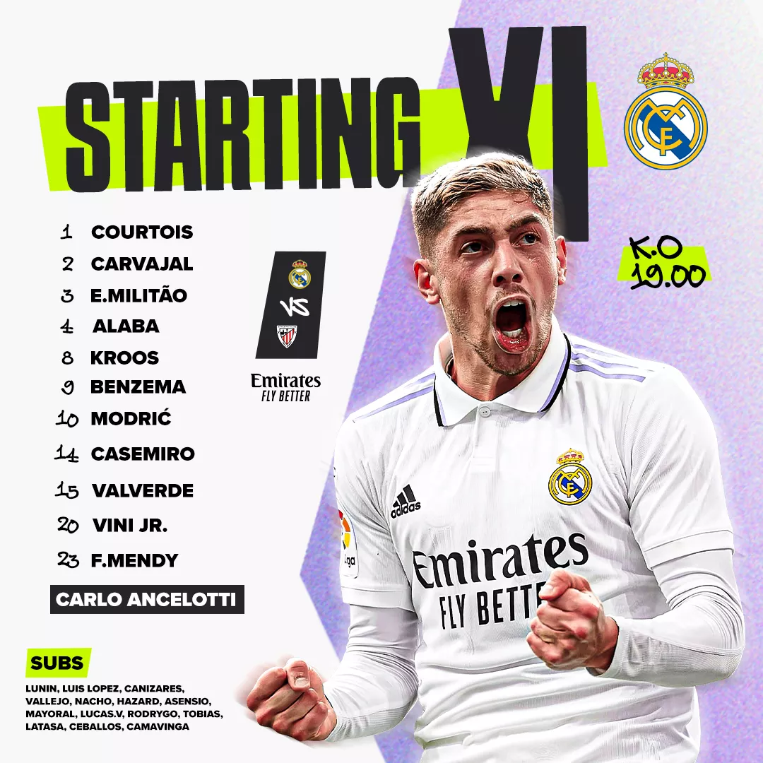
The approach was built around translating Real Madrid’s evolving visual identity into a digital experience that felt bold, premium and intuitive. Taking inspiration from the chevron detailing of the club’s purple away kit, I developed a graphic language that could flex across the UI, social content and motion, introducing accents of green and black from the third kit to create a more contemporary palette. Clean white interfaces were deliberately used across information-heavy areas to prioritise clarity and usability, while expressive typography, adapted chevron forms and graffiti-inspired details brought energy to campaign moments. This balance of functionality and visual expression created a cohesive system that respected the heritage of Real Madrid while presenting the club through a distinctly modern lens.

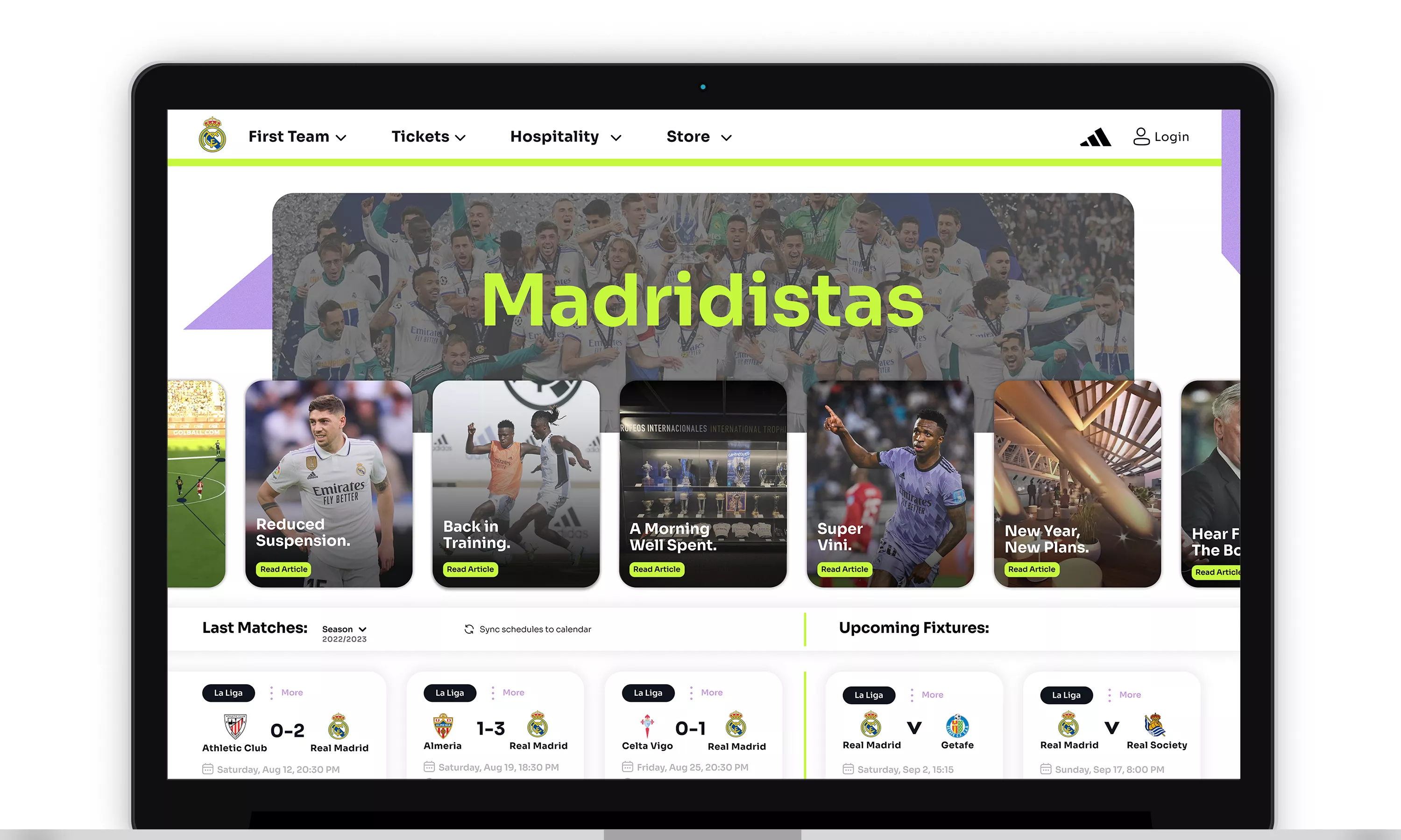

While the pitch was ultimately unsuccessful, the creative direction was extremely well received by the client and remains a project I am particularly proud of. Exploring a new digital direction for a brand of Real Madrid’s scale challenged me to think beyond established conventions and create something ambitious, expressive and progressive. Although the concept never entered production, it became a strong example of my approach to iconic brands, respecting their heritage while confidently exploring how their visual identity could evolve.