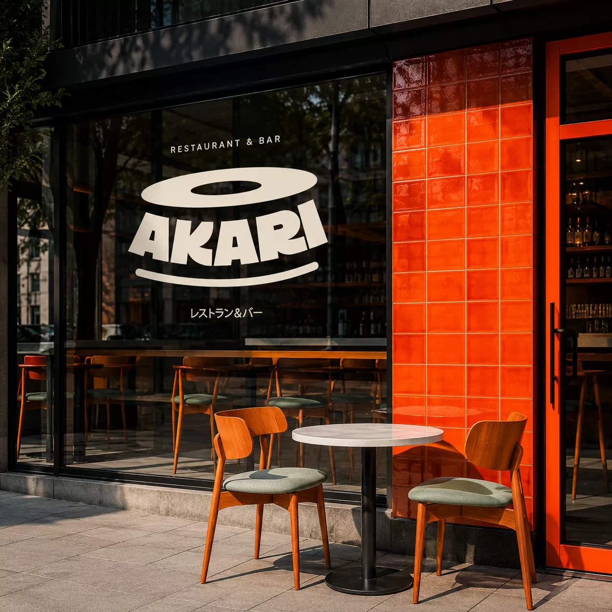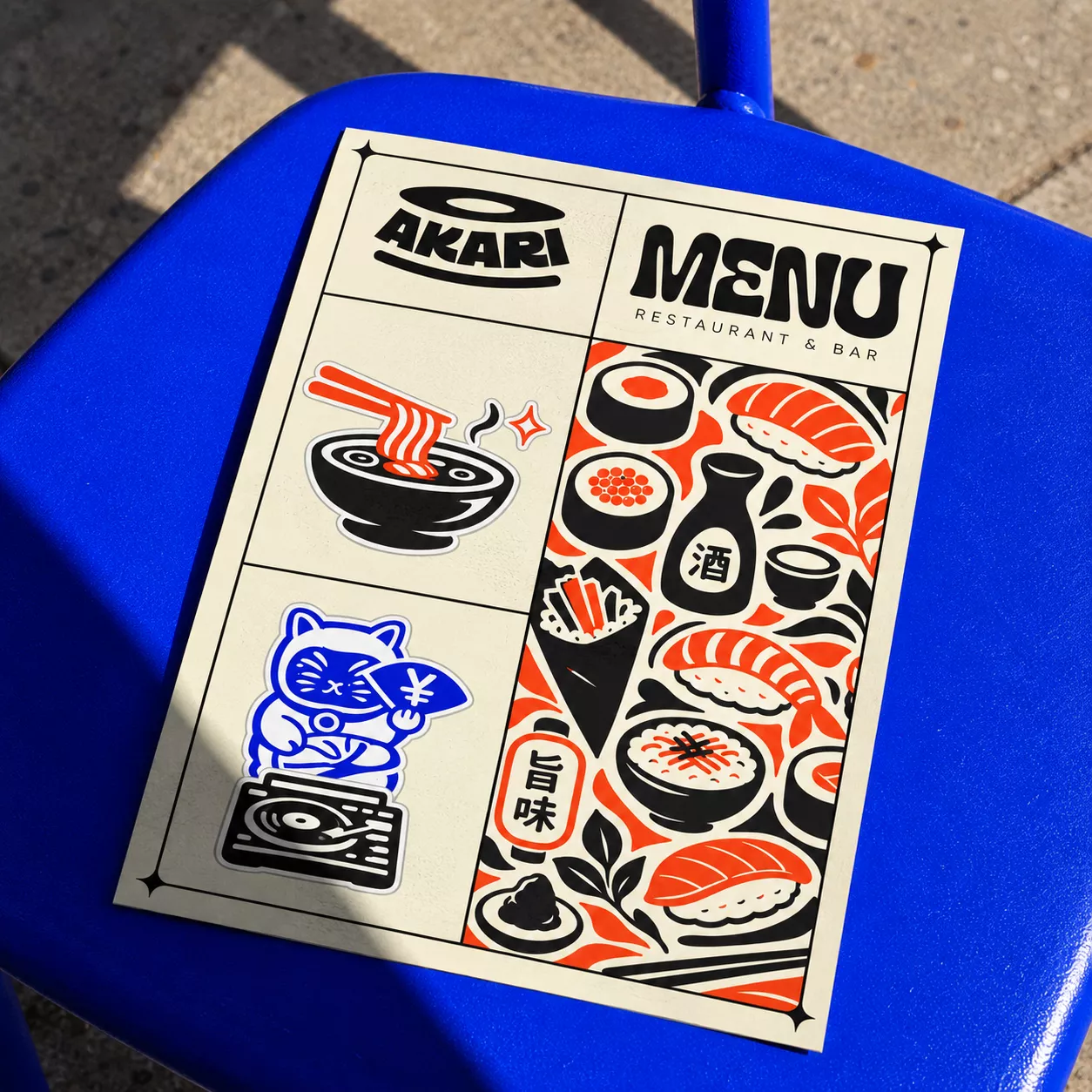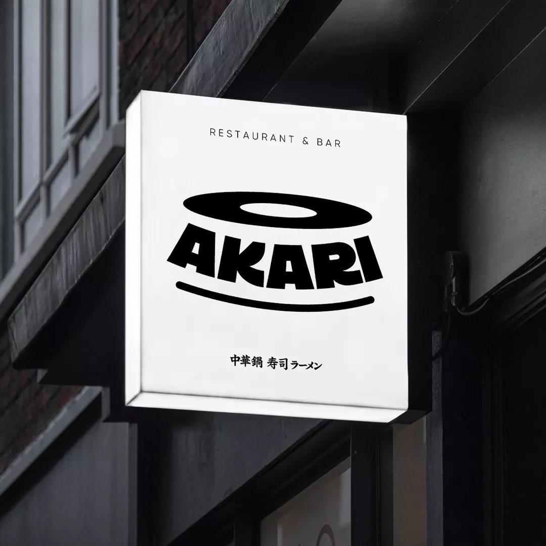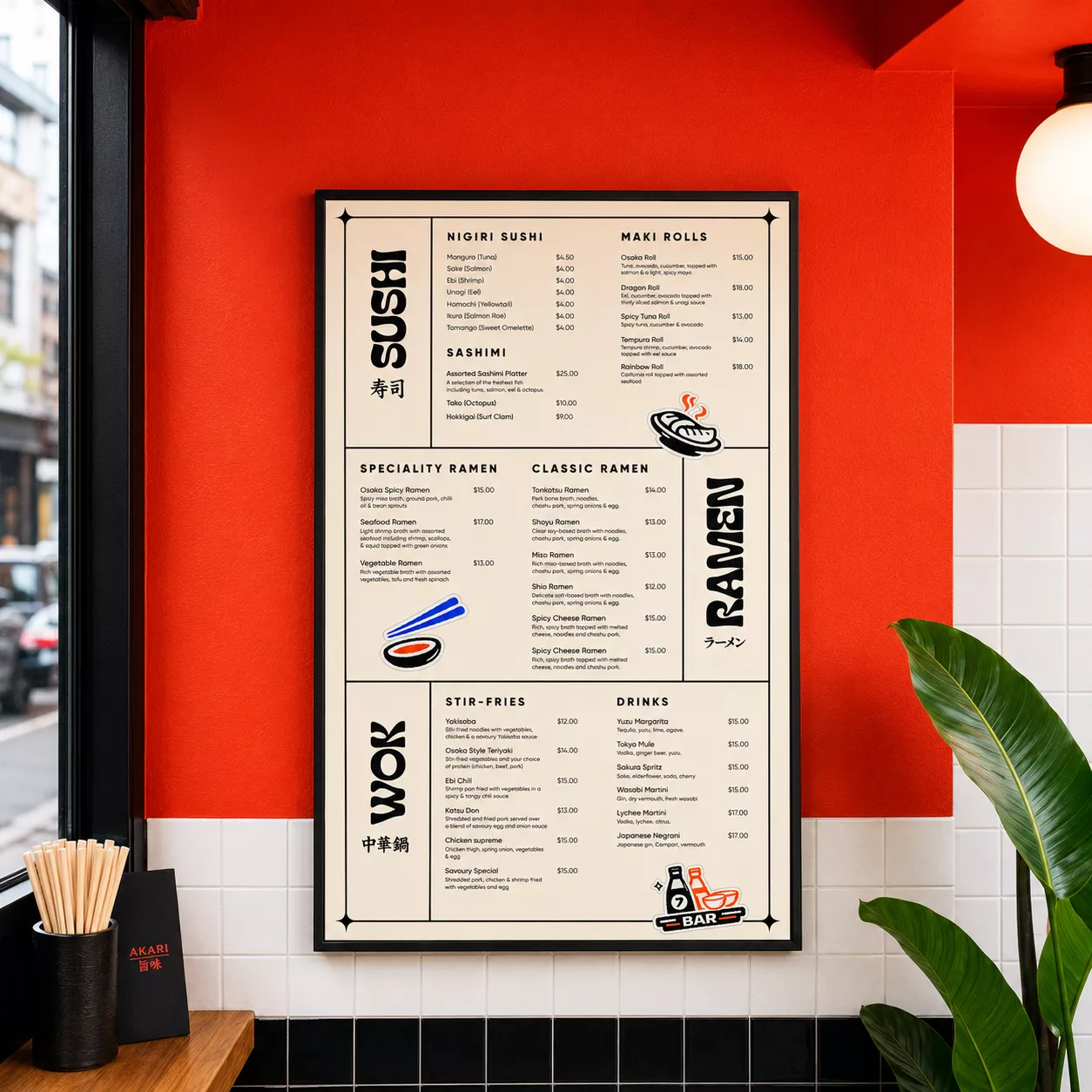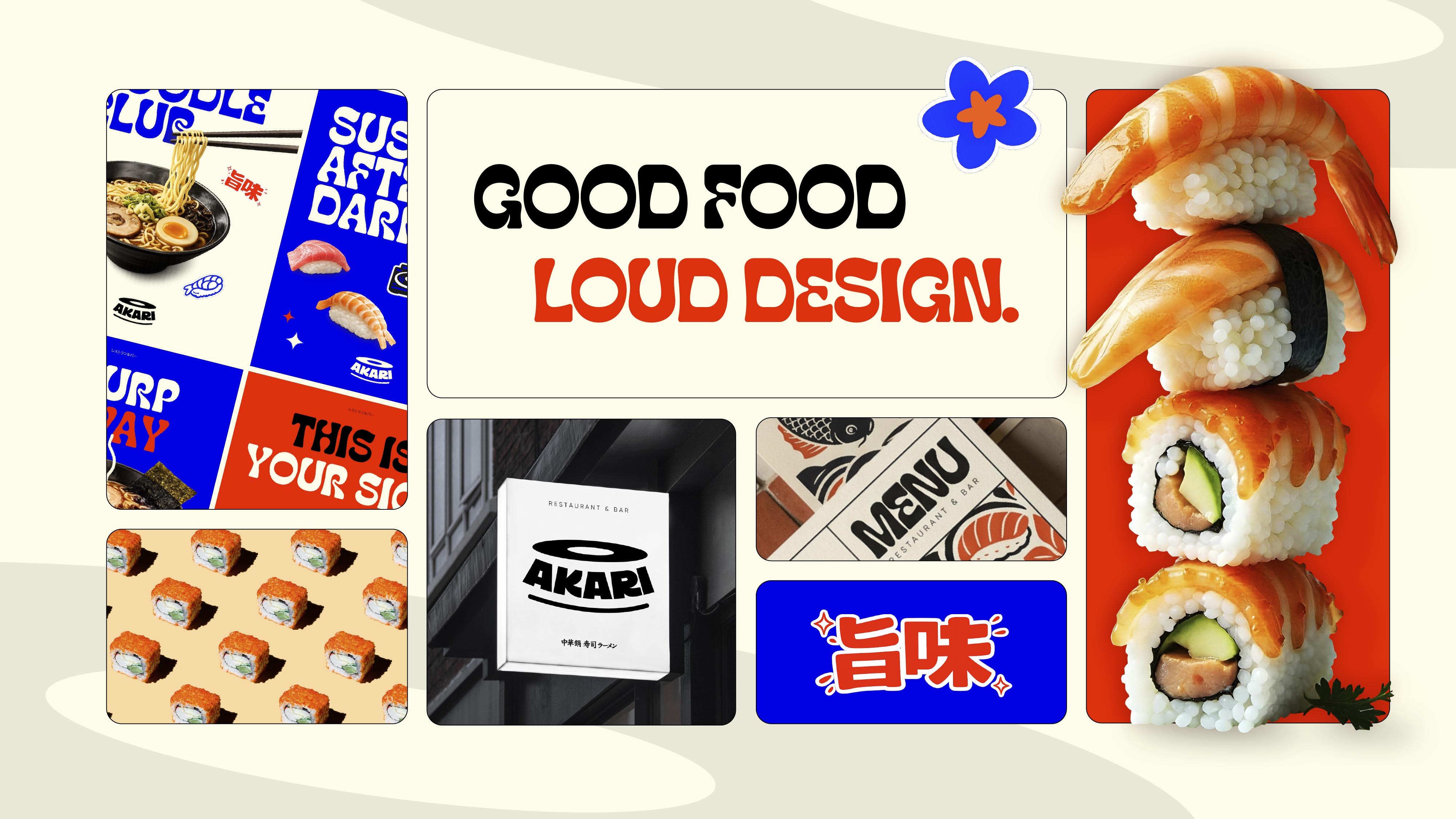
AKARI is a bold Japanese restaurant and bar concept created for a new hospitality start-up in Australia. I helped shape the brand from the ground up, developing a vibrant visual identity that reimagines Japanese culture through a contemporary lens. Expressive typography, high-impact colour, playful graphic elements and an energetic art direction come together to create a distinctive brand world designed to feel as exciting, social and memorable as the dining experience itself.
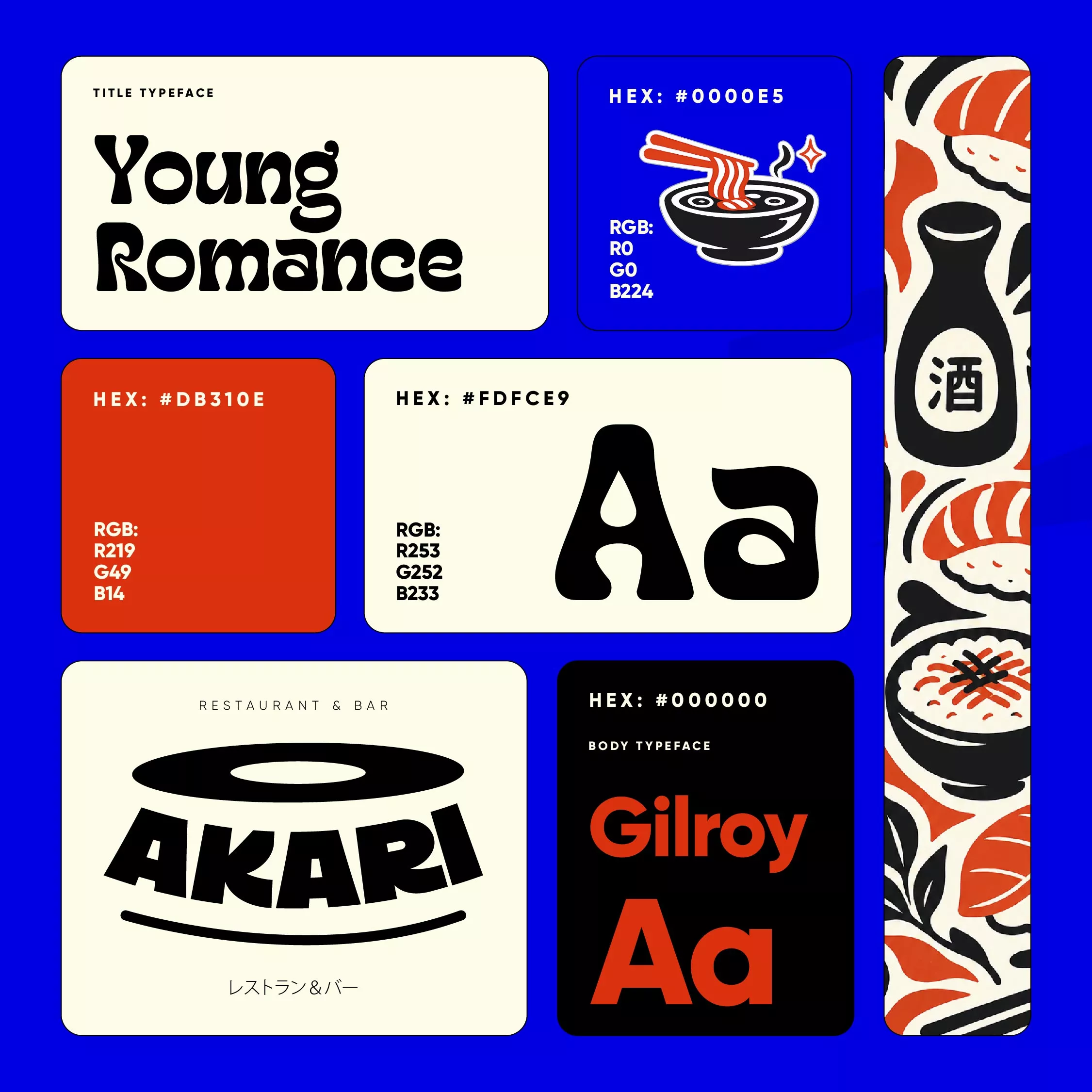
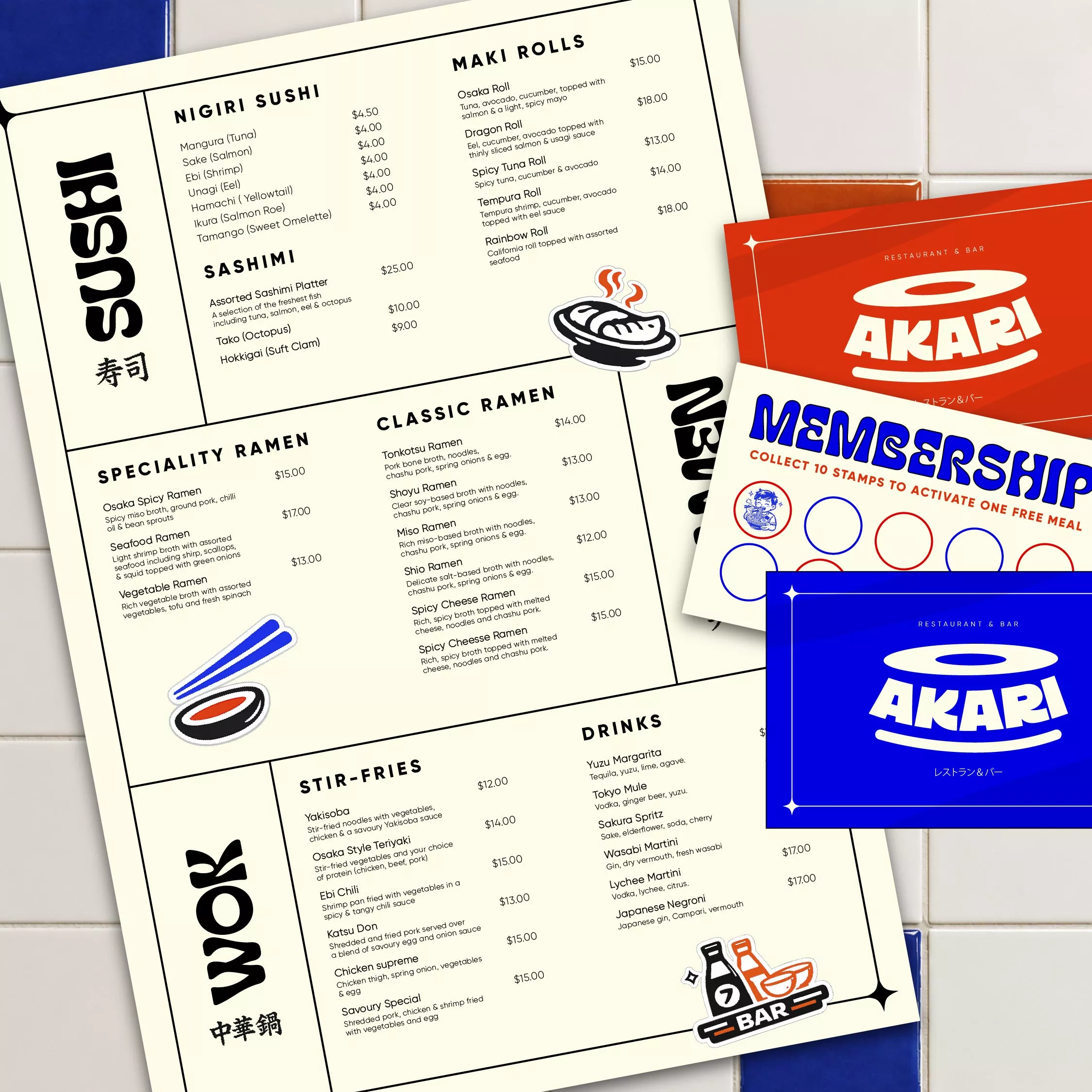
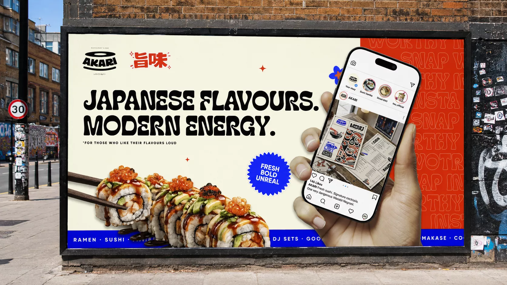
The approach was centred around breaking away from the traditional visual language often associated with Japanese dining. Rather than leaning on minimalism and familiar cultural cues, I pushed AKARI towards something louder, bolder and more expressive. Vibrant colour, oversized typography and playful compositions were used to build a high-energy identity that would stand out in a crowded hospitality market and connect with a younger, design-conscious audience. The result is a brand that feels unmistakably Japanese, but through a fresh, contemporary and culturally relevant lens.
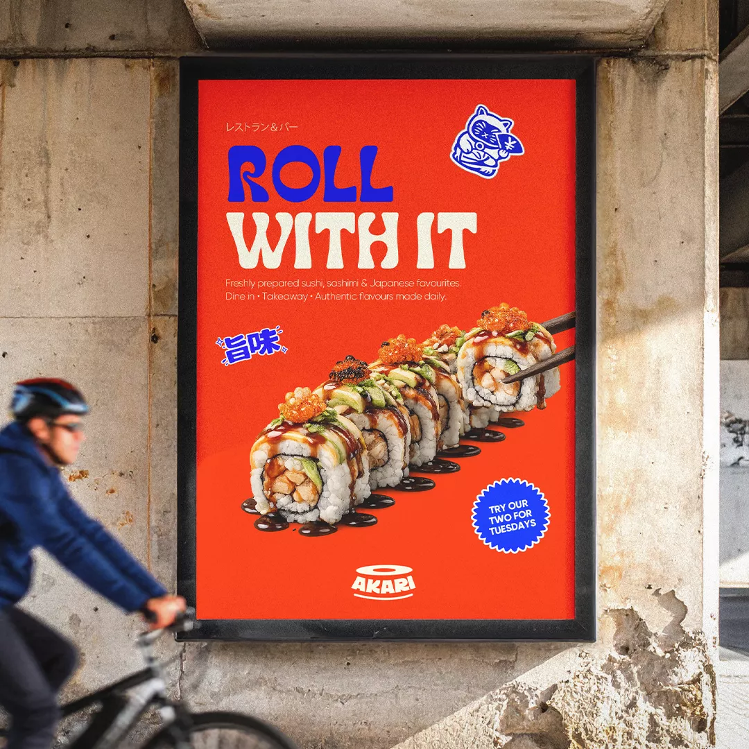

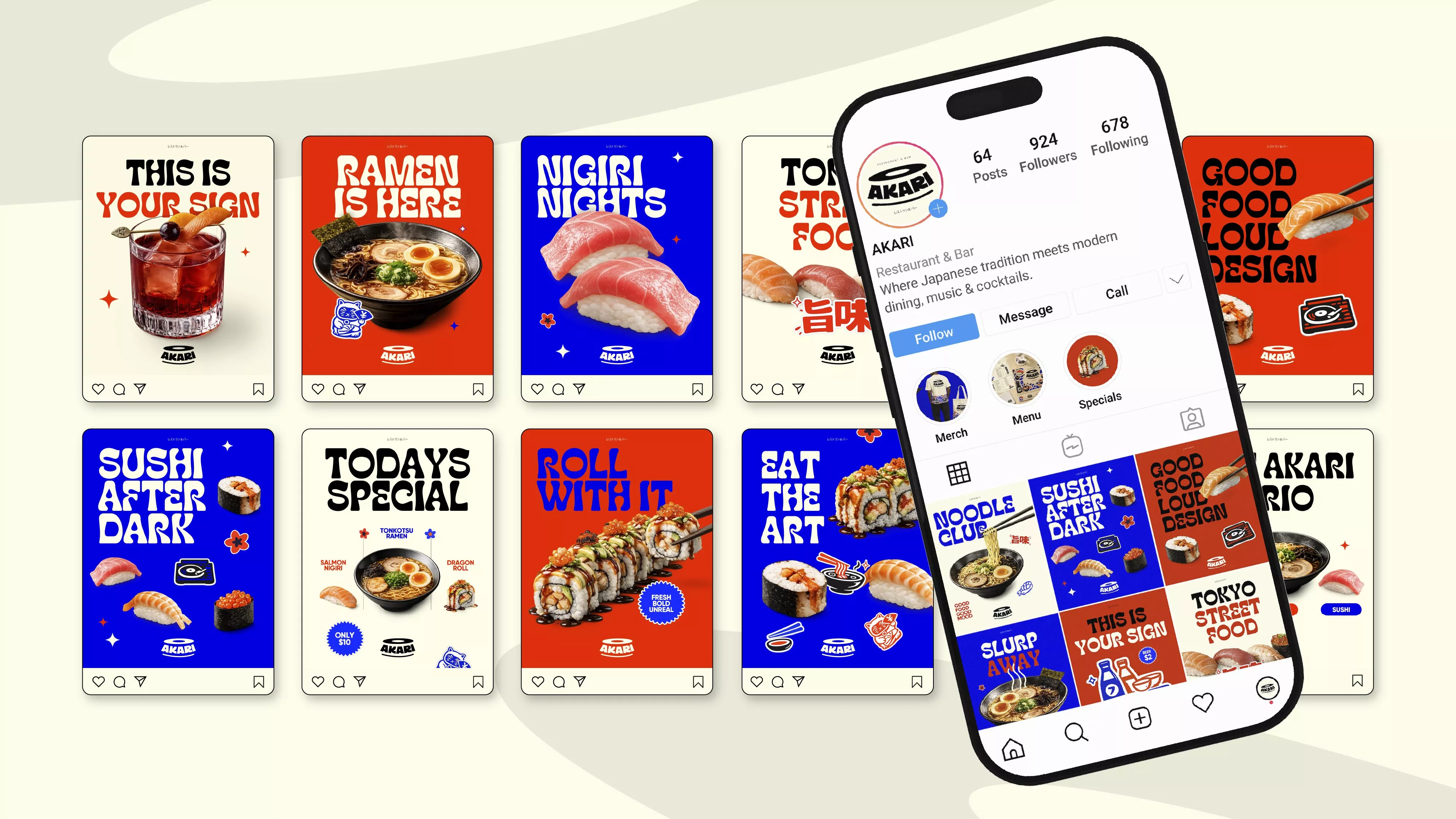
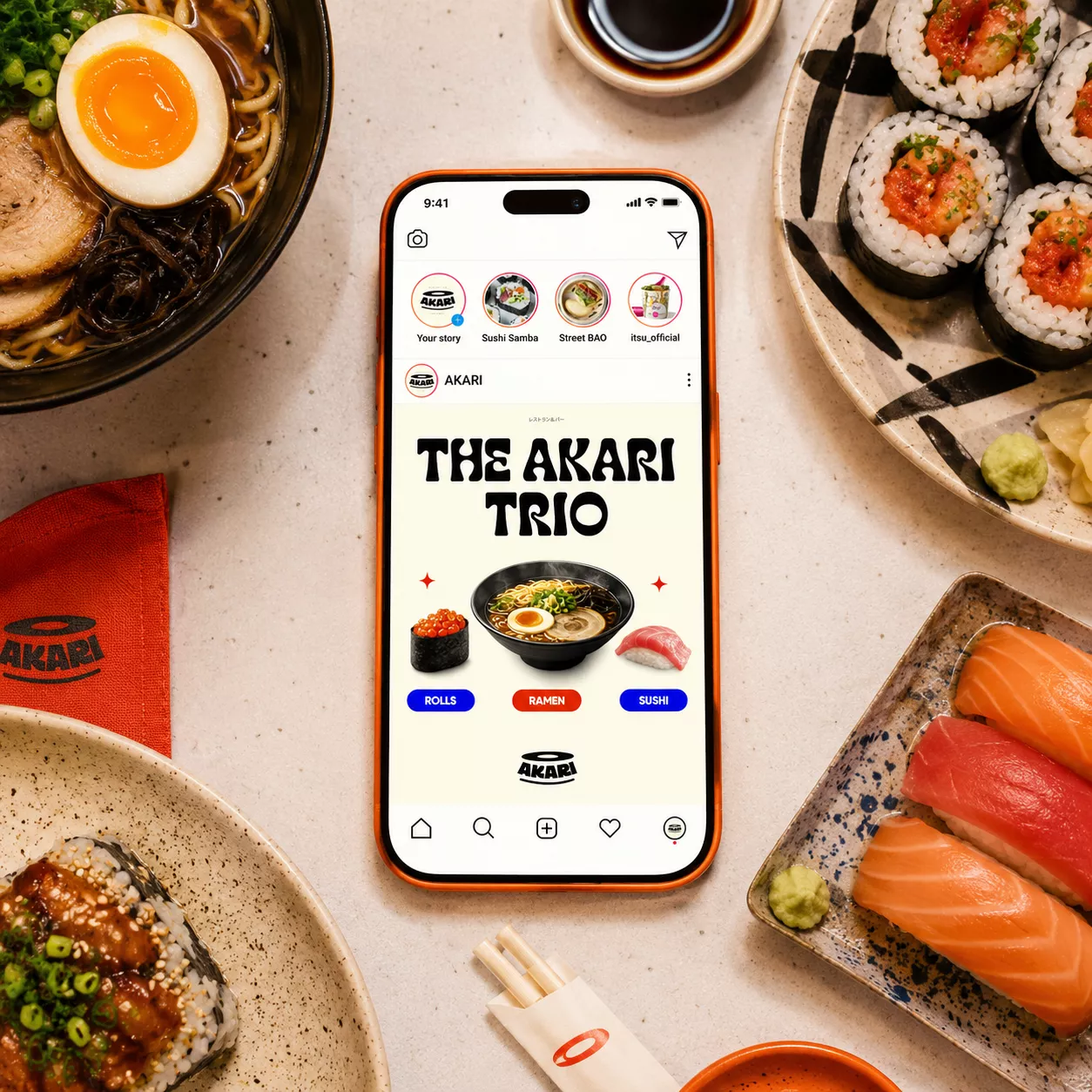
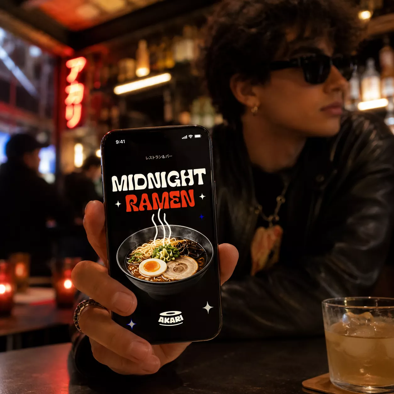
The result is a confident and instantly recognisable brand that gives AKARI a strong presence from launch. The identity translates seamlessly across menus, digital touchpoints, social content and the physical restaurant environment, creating a cohesive experience at every interaction. More than simply looking different, the brand gives the start-up a distinctive personality of its own - energetic, contemporary and built to resonate with a new generation of diners.